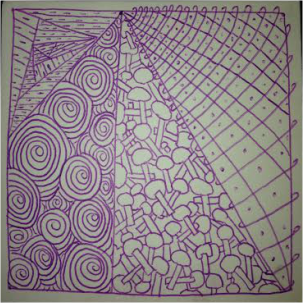
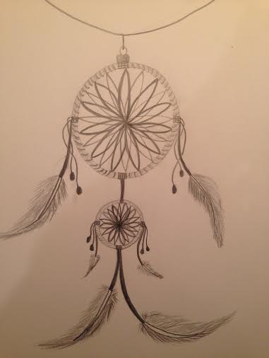
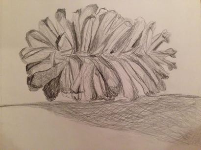
Assignment #1: Zantangle1
|
The Zentangle activity allowed me to relax, while I created each section of my piece. I felt calm without having to worry about specific measurements or erasing mistakes. I enjoy right brain exercises because they help me escape the everyday pressures. I used line in both of my zantangle projects. The straight and curved lines create variation on the paper. My favorite shape is a triangle, which is displayed in the second zantangle. Although each section has a different pattern, they unite together through the triangles. I used the negative and positive space to create an overlapping illusion. I genuinely appreciated the freedom allowed when creating my zantangle.
|
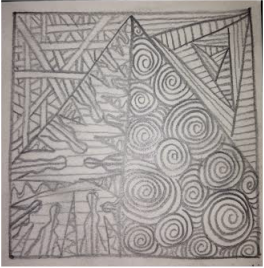
Assignment #1.2: Zantangle2
|
Assignment #4: Modified Contour
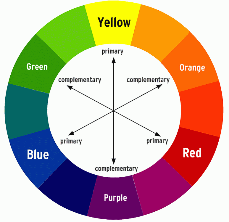
The Color Wheel:
The Color Wheel: The primary colors are yellow, red, and blue, and they cannot not be made by mixing two colors together. Secondary colors are made by mixing two primary colors. The secondary colors are green, orange, and purple. Cool colors are on the left side of the wheel between, yellow-green and purple-red. Warm colors are on the right side of the wheel between, red and yellow. Complementary colors are directly across the color wheel from each other. For example, green and red are complementary. The intermediate colors are between the primary and secondary colors, such as blue-green or red-orange. Analogous colors are colors that are next each other on the color wheel, such as green, green-yellow, and yellow. Triad color schemes are colors that are equally spaced out on the color wheel. Primary and secondary colors are triad color schemes.
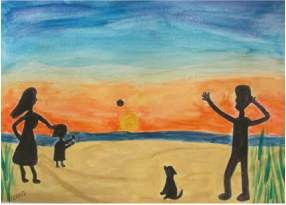
Assignment #11: Watercolor Service Project
My water color project depicts a family playing catch on the beach with the dog. The family is a black silhouette to add emphasis on the color of the sun setting over the beach water. I added purple and yellow into the figure of the people and the dog to bring out the color of the sky. I really enjoyed this project because I had never worked with water color before. Also, painting is my favorite activity!
Assignment #14: Tortoise Binding
I like the look of the tortoise shell binding much better than the simple binding. Although I enjoyed the simple binding, I thought of it was more of a solid foundation for the tortoise binding. The process of binding the book was difficult at first, but once I got the hang of it, it was not too complex. I used the other half of my painted paper from assignment thirteen to create the covers of my book. I am exciting to make use of my new books!
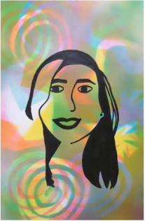
Project #5: High Contrast Portrait
|
Assignment #5: Elements of Art The elements of are include: Line, Shape, Form, Color, Value, Texture, Space. In order to remember the elements, Hannah and I created a silly sentence. The sentence is as follows: Linus colors valuable textiles formally shaped in space. 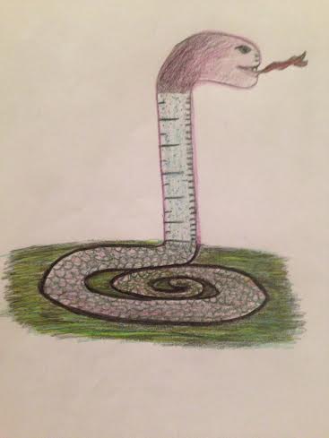
Assignment #9: Preposterous Crosslinks
My crosslink is between a snake and a ruler. The body of my creature is the inorganic object, the ruler. The head and the tail resemble the snake. I call my crosslink a "snuler."
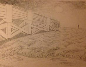
Project #2: Art 2: Graphite Drawing
The graphite drawing above is inspired by a photo I took at Atlantic Beach. I used hatching and cross hatching to create a dark effect in the sky. I used an eraser to create the waves breaking on the shore. The columns on the pier stand out because the white, blank space. The barnacles at the bottom of the post, as well as the specs in the sand, were done by stippling.
Assignment #12: FREE DRAW
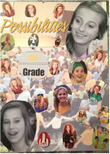
Project #6: Yearbook Collage
I had a fantastic time working on my personal yearbook page. I found all the photos of myself and my five best girlfriends since middle school. I collaged our pictures onto the back page of the year book that said "possibilities." I though this page was representative of all the possibilities that available when you live your life surrounded by great friends. Hannah Russo, Lake Hoard, Molly Holton, Avery Davis, and Lauren Boone have shaped my life immensely since the 8th grade, and I know that the possibilities in my life are endless with the support of these wonderful friends.
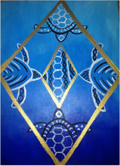
Assignment #16: Acrylic Painting
|
Assignment #7: Hatching and Cross-Hatching
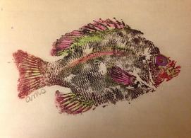
Project #1: Modified Gyotaku Print
I printed my fish in black ink because I thought the color would show up the best. I went back in with green and red water color because they are complementary colors that look really well together. I added accents of purple and pink because those colors popped when placed on the black ink. The black and red colors made me feel attracted to the fish because they are both very bold colors. The green, pink, and purple made me feel happy because they are bright, yet still calming. Printing this fish was fun because I got to do it with my best friend. Modifying the print was my favorite part. I was excited when I found colors that popped and made the fish look vibrant. The water color pencils worked well and that was a new experience for me. The wet-mount was the most difficult part. I had never wet-mounted a print, but Nick helped me step-by-step. I liked how the back ground looked even whiter once the fish was mounted. I also enjoyed that the paper became stiffer. Along with advancing in my art skills, I am advancing in my learning skills. A self-directed learner takes the basic concepts and expands upon them inside and outside of the classroom. I believe I have been a self-directed learner before this semester. However, I have learned new concepts in art, and I have worked on them in my sketch book at my house. I have looked up videos on how to do specific techniques, and I've worked on those techniques outside of the classroom. I am excited to expand upon my art skills. 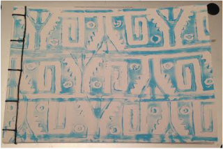
Assignment #13: Simple Slab Binding
I enjoyed this assignment very much!
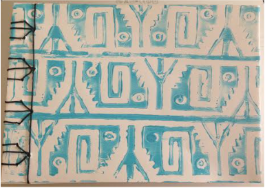
I created my cover pages by painting on paper with patterned rubber rollers. I chose blue on the front and gold on the back because I thought those colors complemented the aztec print. I also liked how the black thread stands out on the light blue color. The wax thread was easy to maneuver, making the binding a simple task. Although the binding was not too complex, it created a sophisticated look that I really enjoy. I cannot wait to use my book! Assignment #15: Print Making
After some confusion with the print making project, I began to create my prints a few weeks late. I really enjoyed the process, and I love the way my prints turned out! I had to do a speed process in order to finish on time. I would enjoy to make more prints in the future. I had a grand time naming each of my prints based off the color variations in the art work! The last print was my favorite because the color really shows the texture. I am grateful for being allowed to catch up, and finish this assignment.
|
